

BAMBEE
Bringing affordable HR to every small business
Founded in 2016 Bambee aims to bring affordable HR to every small business in the country. I joined the team to bring the idea to life and take it to market.
I led product design while growing the company from five to 125 employees and $0 to $25M in ARR. I hired and managed product designers. I owned discovery, wireframing, design, delivery, and improvement of all of Bambee’s consumer-facing and internal products. I evangelized for and led the creation of, from scratch, Bambee’s design system, Pollen. I drove business and design decisions by capturing and analyzing qualitative and quantitative user data. I led creative strategy for marketing campaigns with $1M+ per month in spend. I sourced and managed contract designers to support creative and campaign needs. I launched multi-variant tests with numerous, dramatic company-wide increases in core KPIs.
The Smarter Way to HR Compliance
THE BAMBEE DIFFERENCE
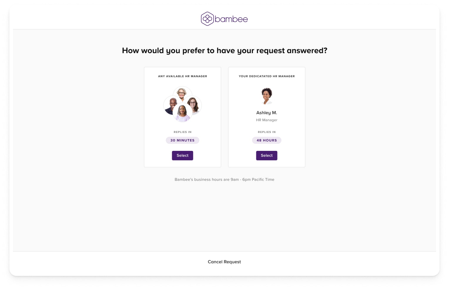
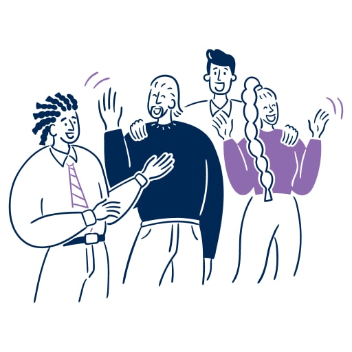
A real, dedicated HR manager who helps SMBs reach HR compliance, easily and affordably.
Real HR Manager + Scalable Software Platform
Bambee fearlessly solves even the most complex HR issues - letting SMBs focus on growth.
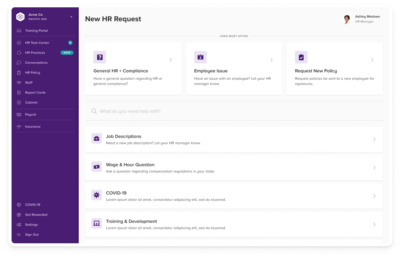
Products & Features
I've launched a number of features at Bambee, here are some of the most notable ones.
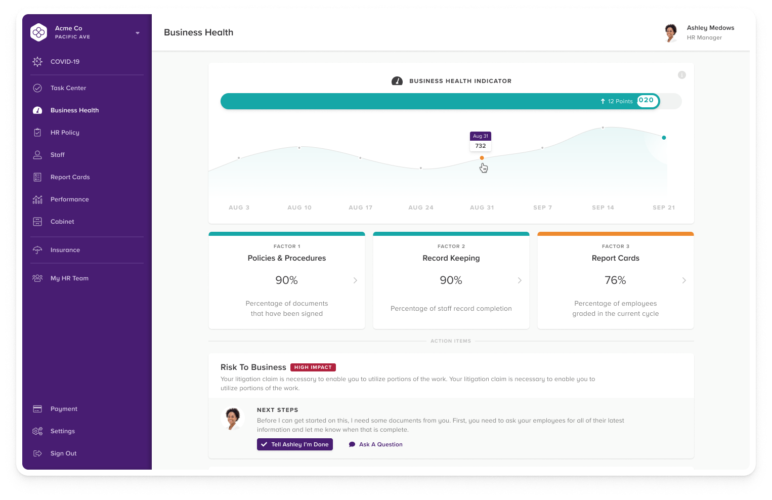
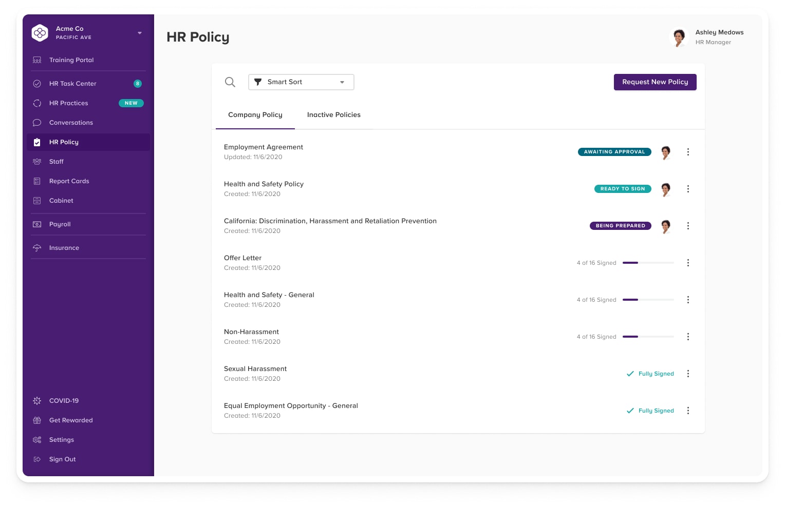
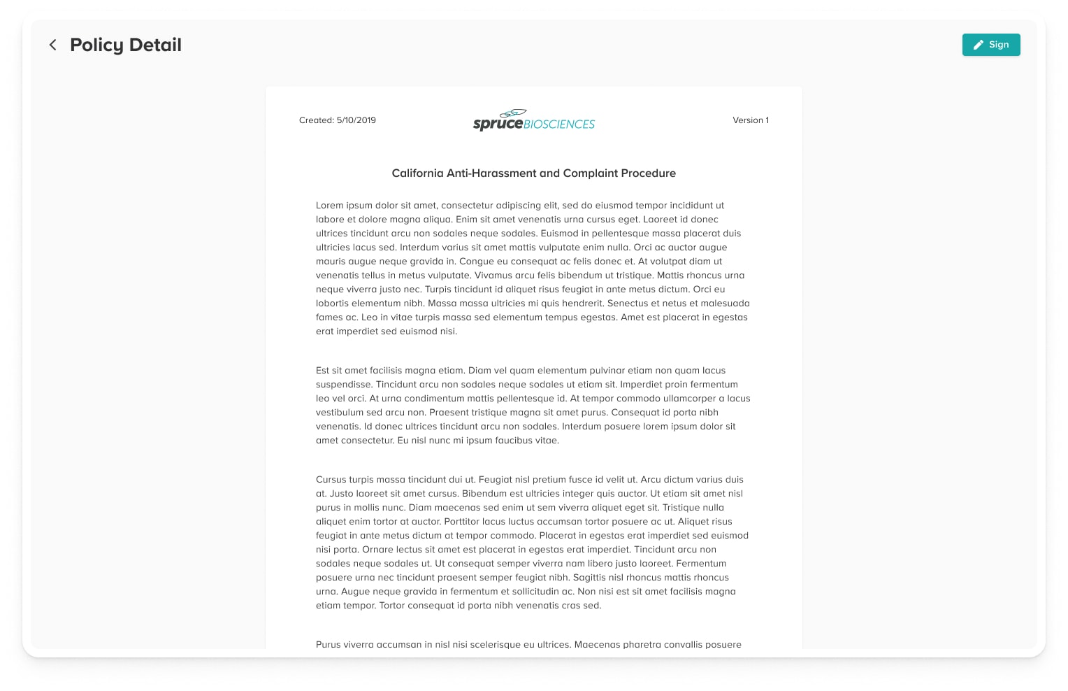
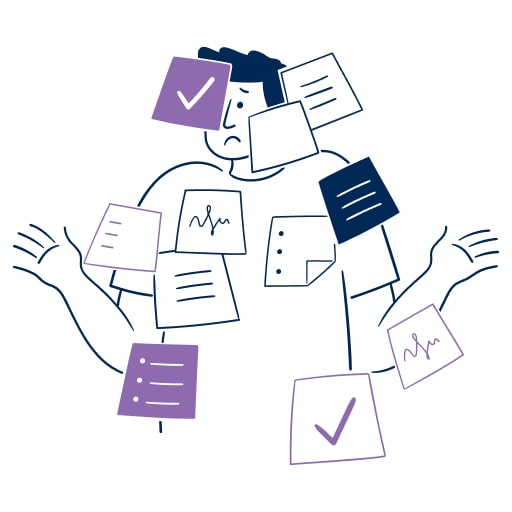
HR Policy
We work with businesses to craft internal HR policies that fit the way they run their business. All of our clients receive our Bambee Core Policies, which are tailored to provide broad protection against workplace incidents. We also craft custom policies to suit the specific needs of small businesses across dozens of industries.
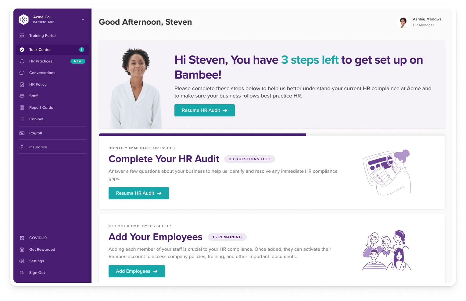
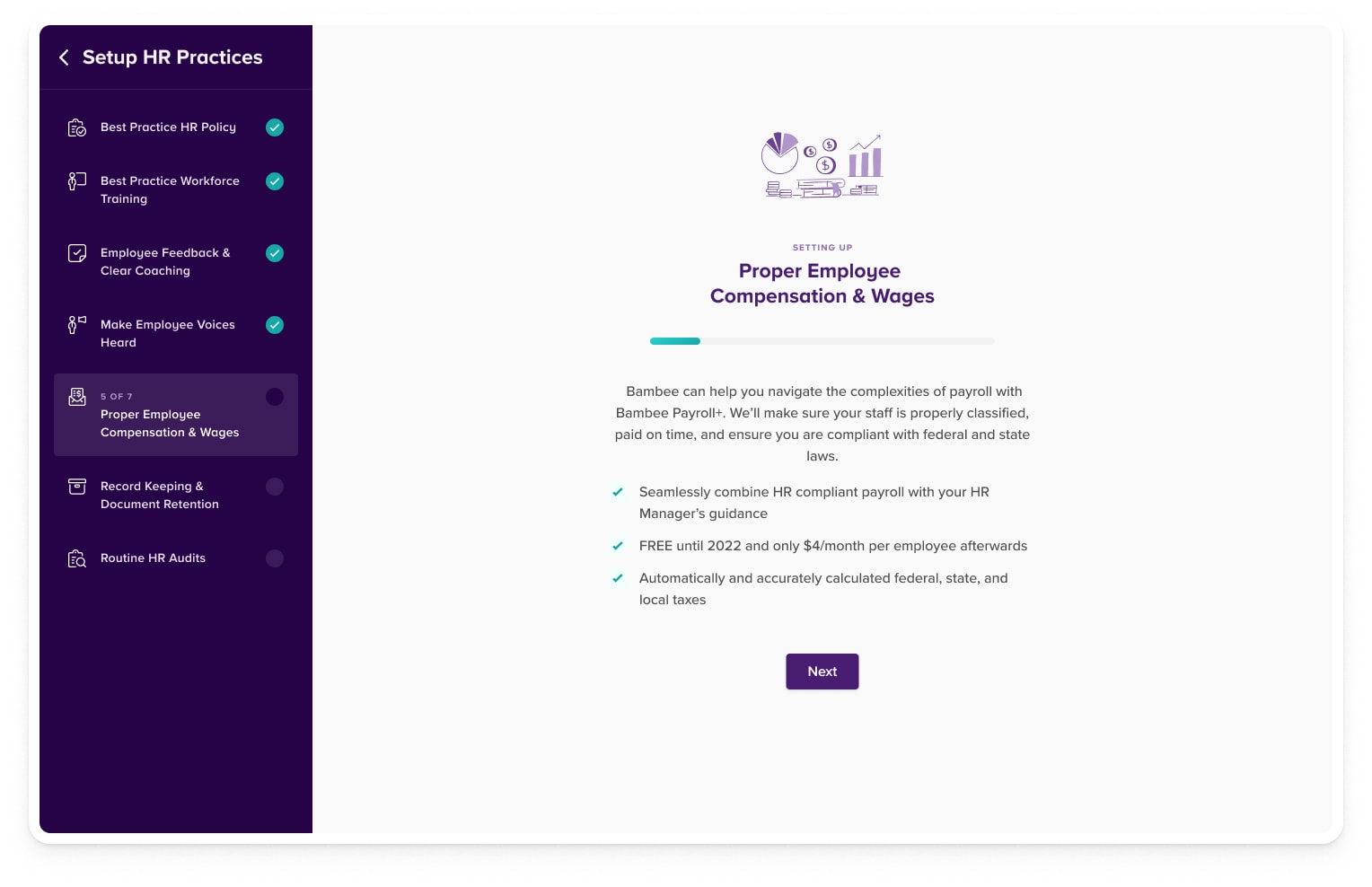
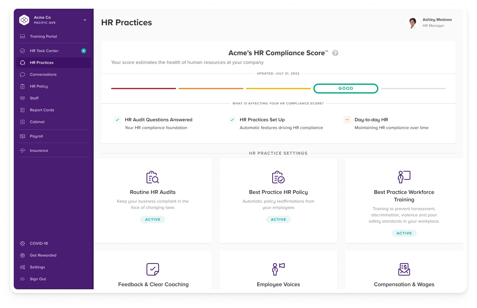
HR Practices
Our HR Practices are the foundation of running an HR compliant business. We guide business owners through setting up our service to suit their needs while ensuring maximum protection.
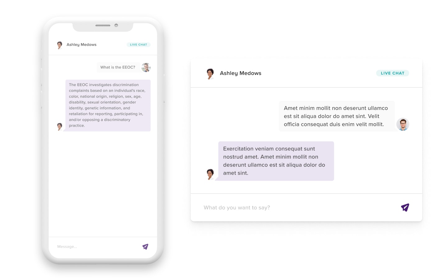
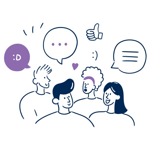
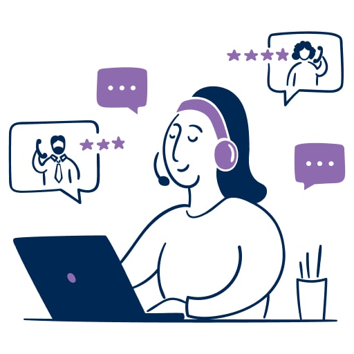
Employer Coaching & Guidance
Unlimited remote HR support, available to help by phone, email, or chat. Consider Bambee an extension of your team.
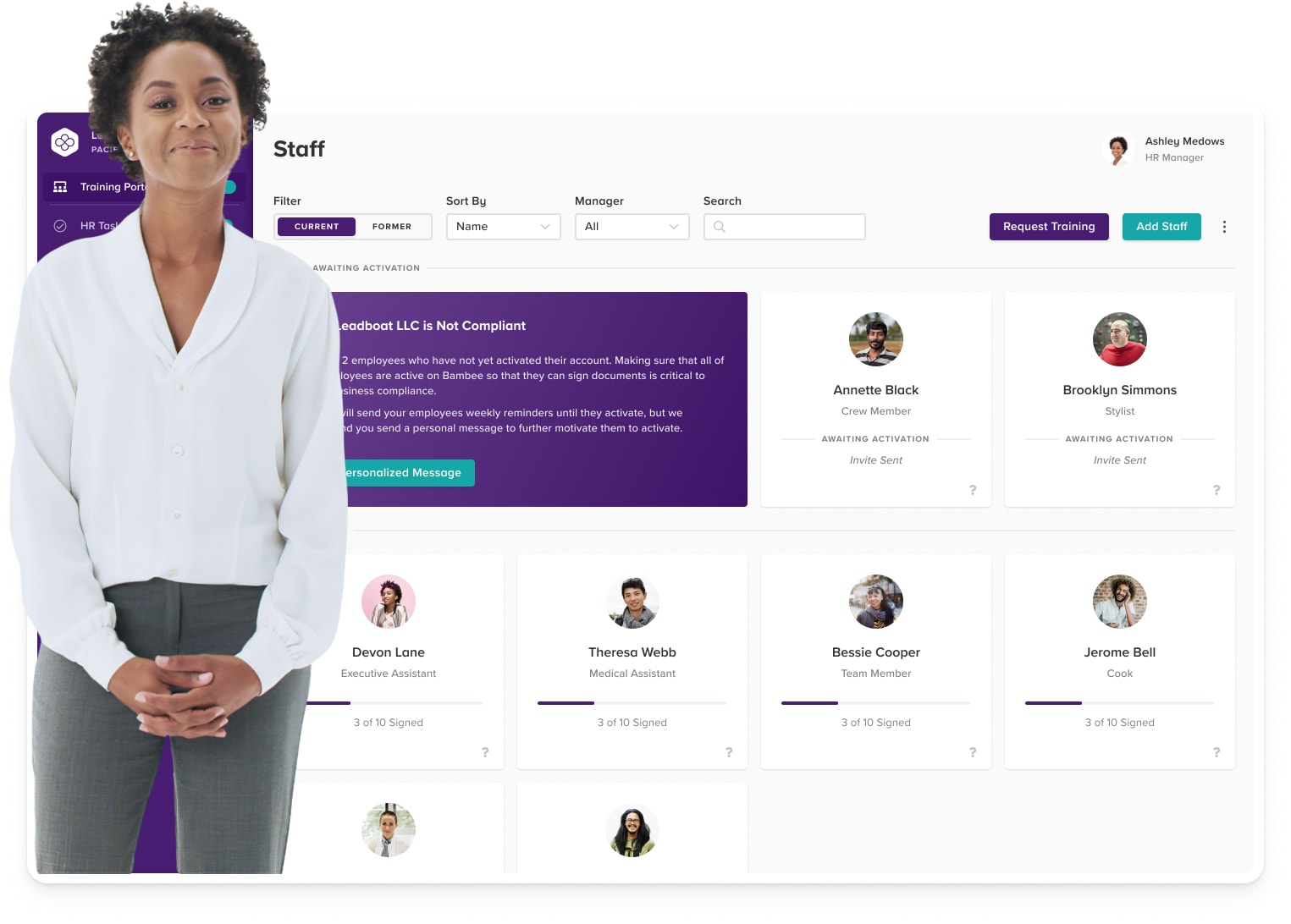
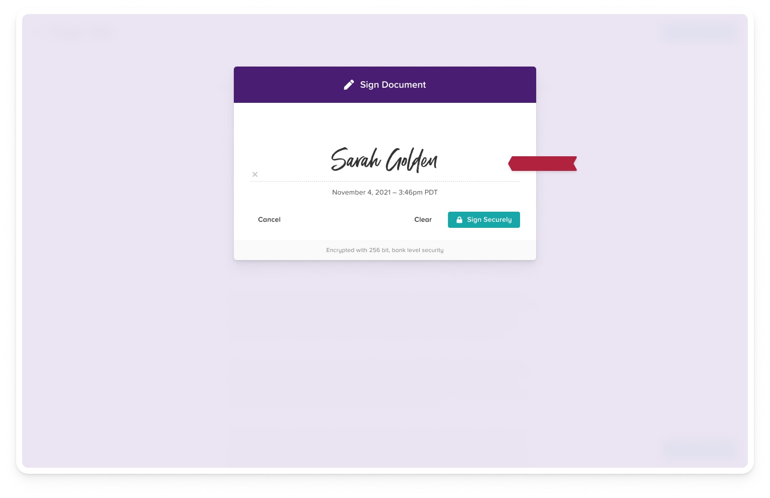
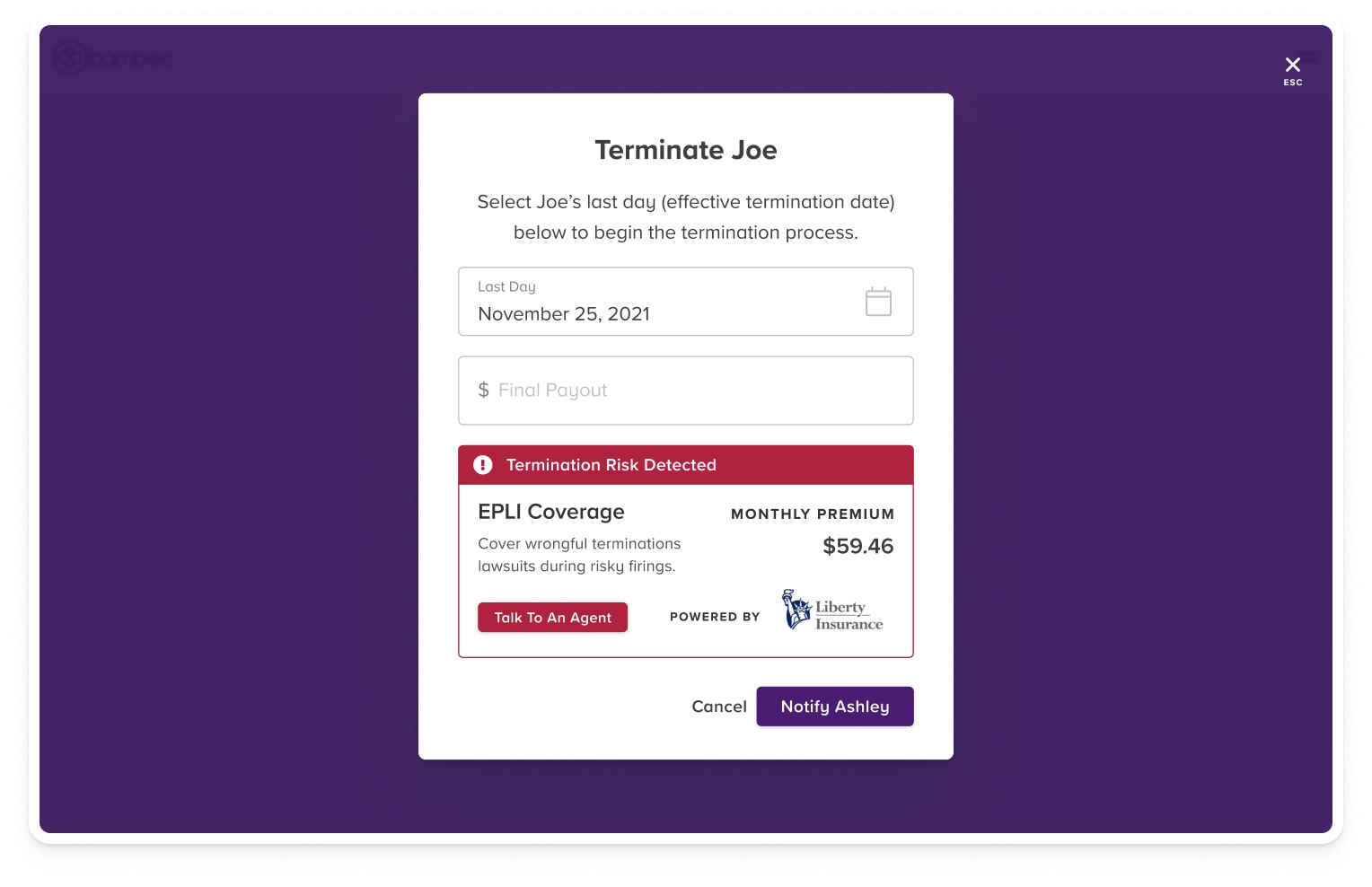
Compliant Onboarding & Terminations
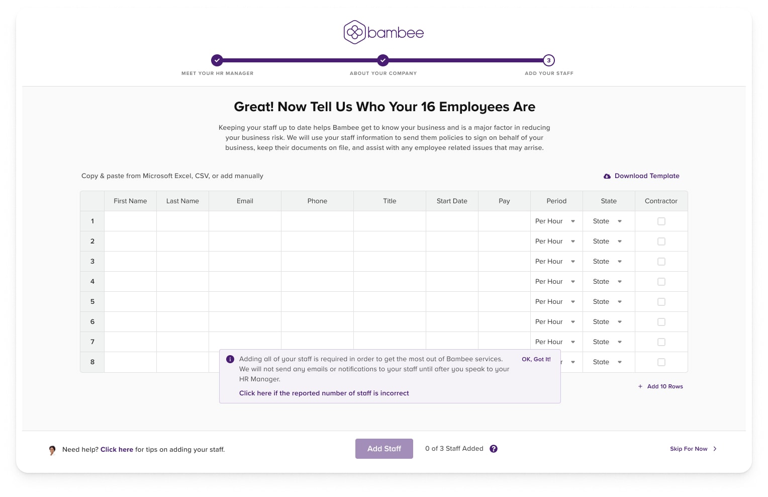
Our platform lets you onboard, terminate, and take corrective action easily and securely. Bambee's compliant terminations product makes sure our clients offboard their employees safely, with the least risk possible.
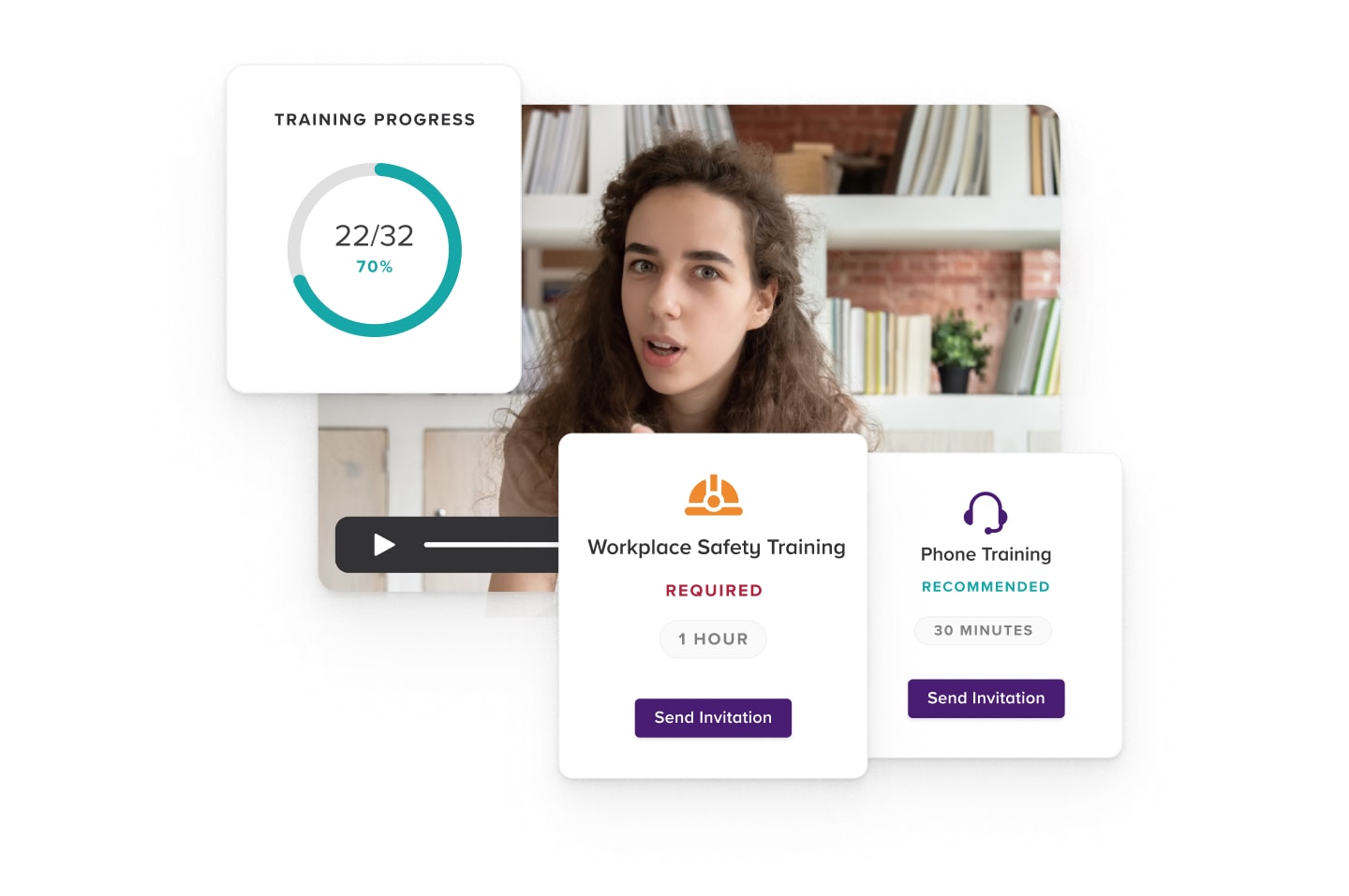
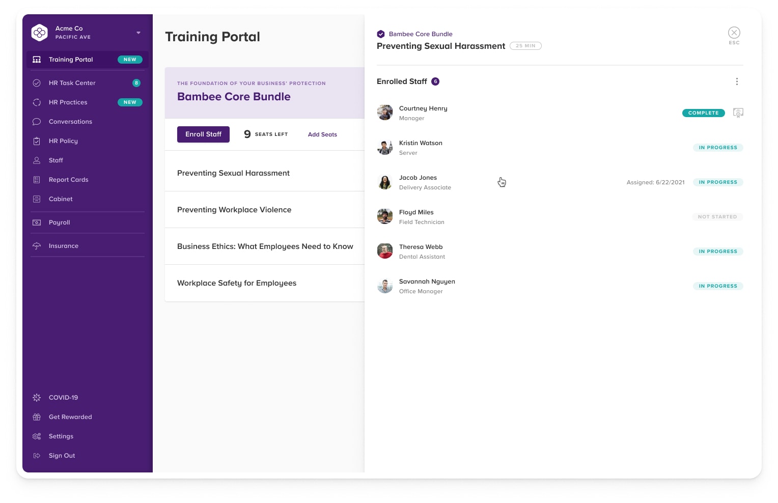
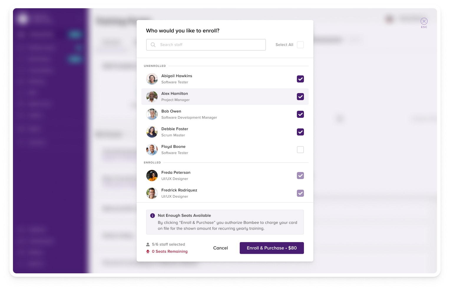
Employee Training
From sexual harassment to OSHA to 500+ other topics, training is customized to your business and available 24/7.
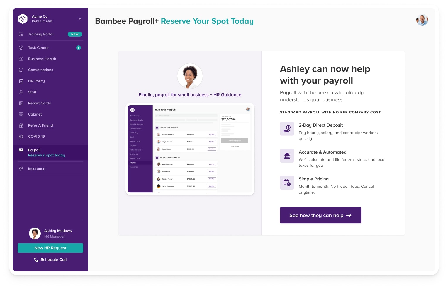
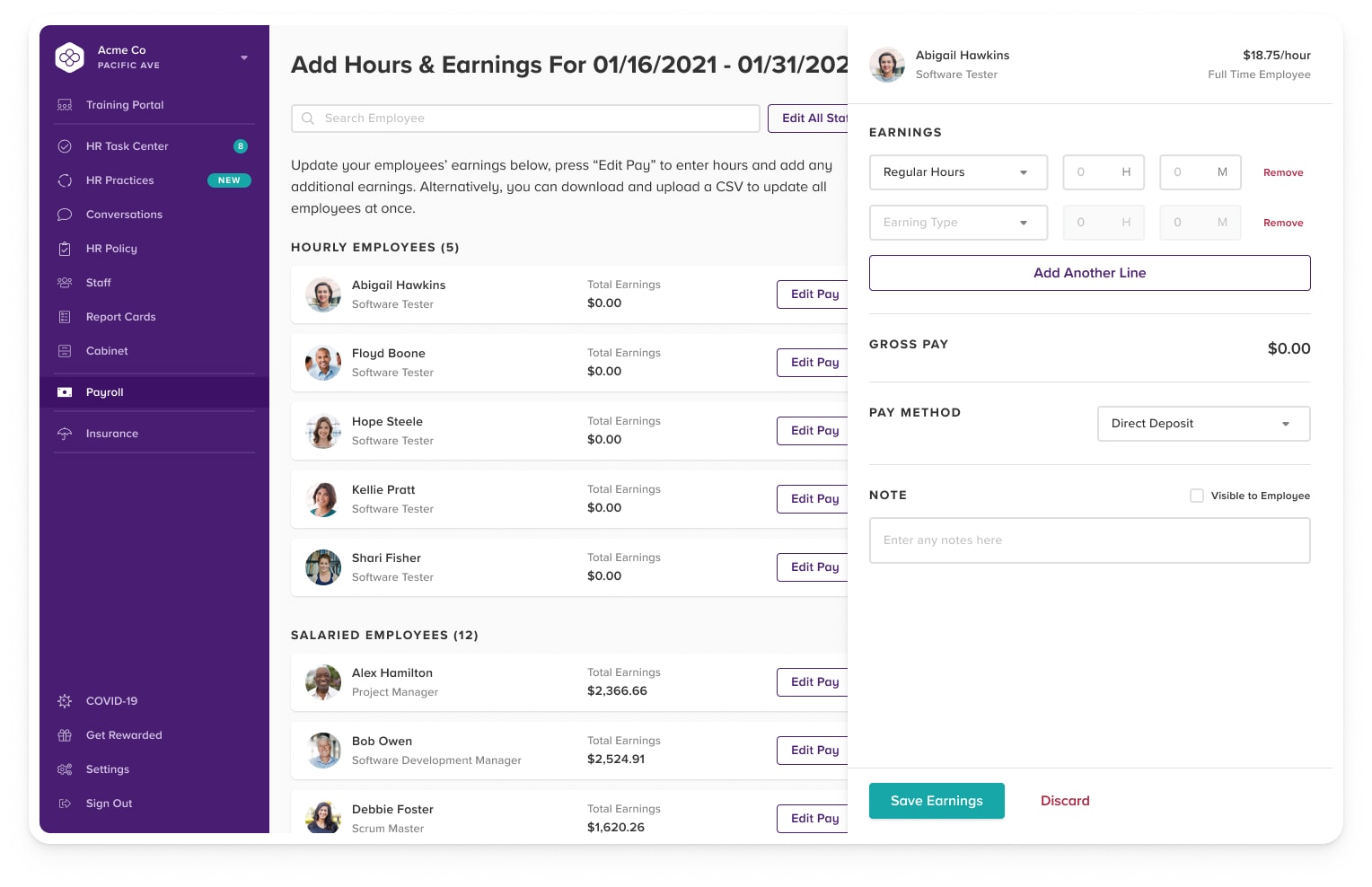
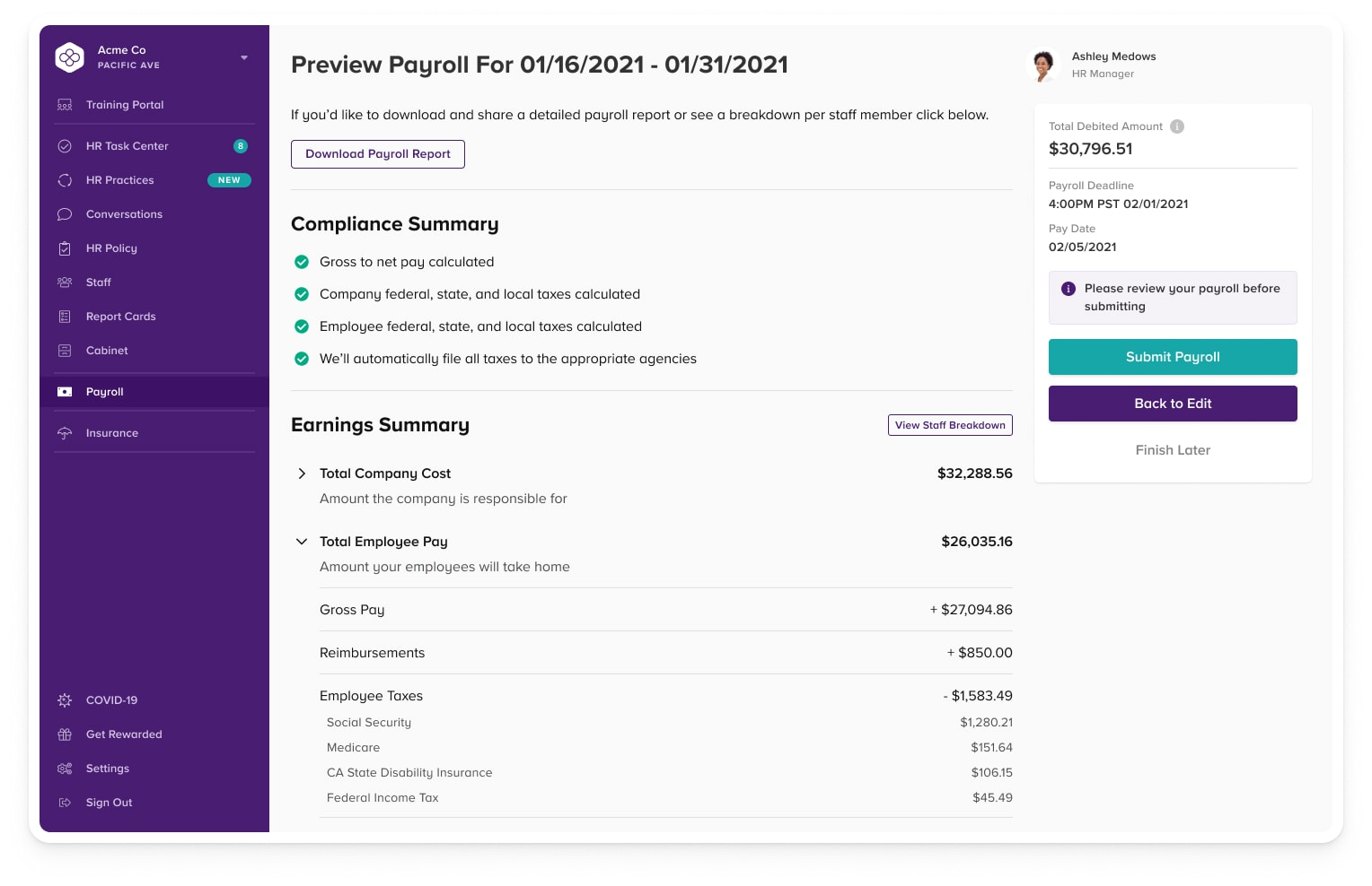
Payroll & Compensation Compliance
Bambee makes sure your business stays compliant with nuanced wage and hour regulations as you grow your team.
Bambee Payroll+ is the first HR-managed payroll platform available to small businesses. We enable companies from 1 to 500 employees fulfill payroll with the guidance of an HR manager.
Pollen Design System
A design system is a collection of reusable components, guided by clear standards, that can be assembled to build any number of applications, and the need for them goes hand in hand with the need for scale, efficiency, and consistency in Design. They bring order to chaos. I created the Pollen Design System to create that order at Bambee. In this project, you will see some of the components I built for this design system but a design system is much more than just a component library. If built correctly it is the lifeblood of your products. Take a look at what I put together below.
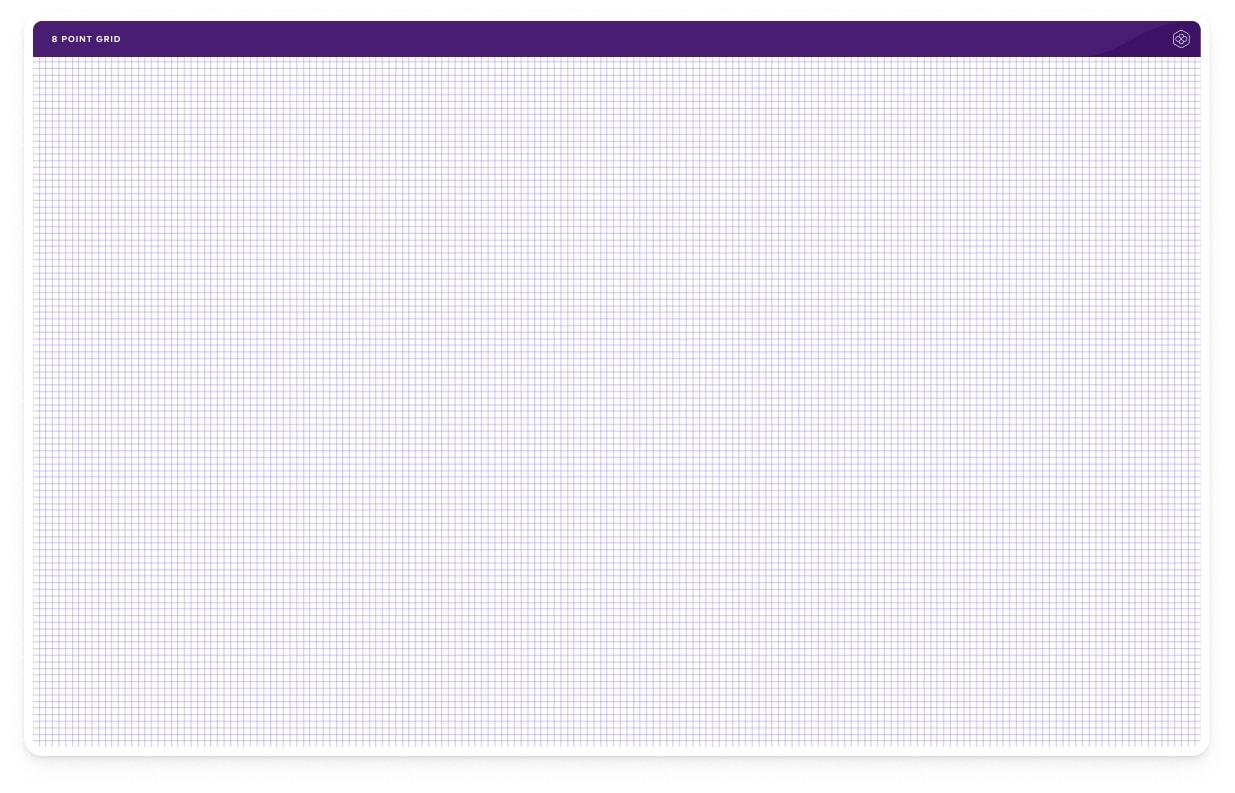
The Foundation
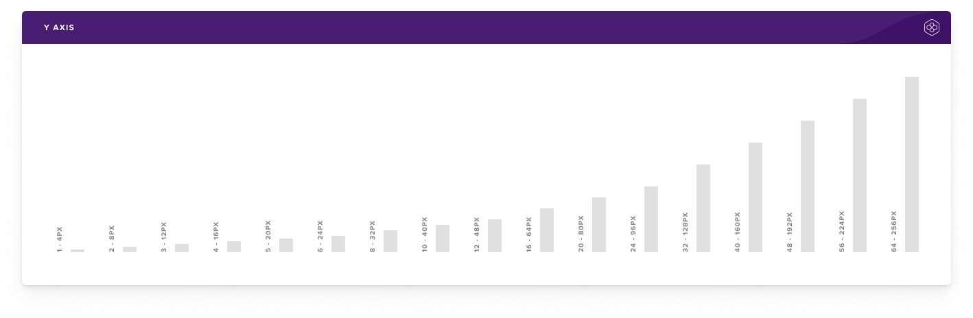
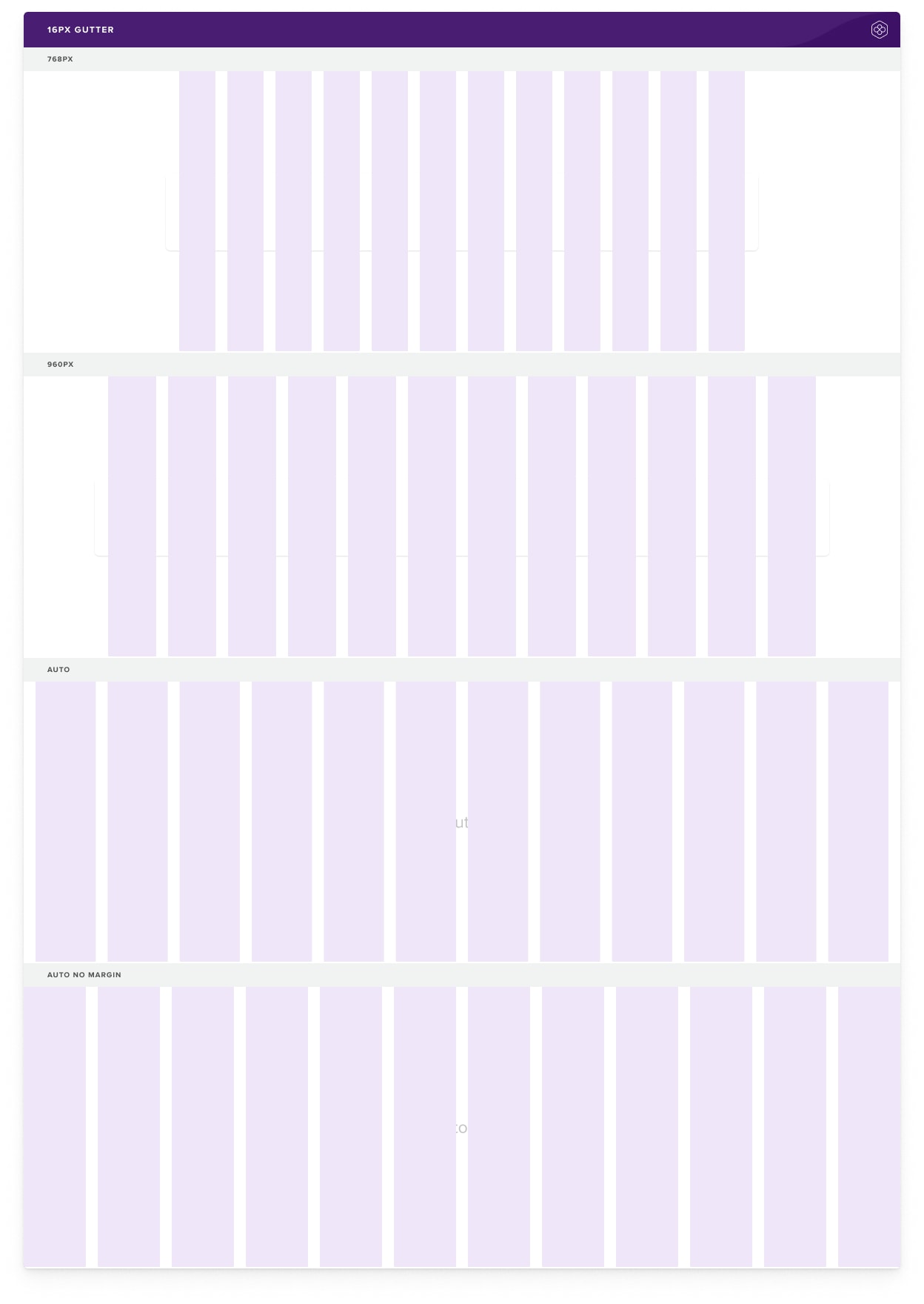
A well-built house starts with its foundation. The foundation of a design system is its spacing and grid system. An 8pt grid system consists of a 12 column grid and an 8px baseline grid. For the spacing system, I went with a rem-based guide that aligns with the 8px grid.
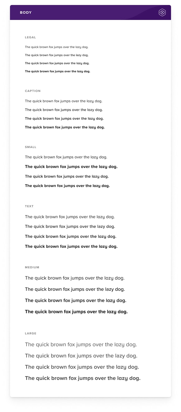
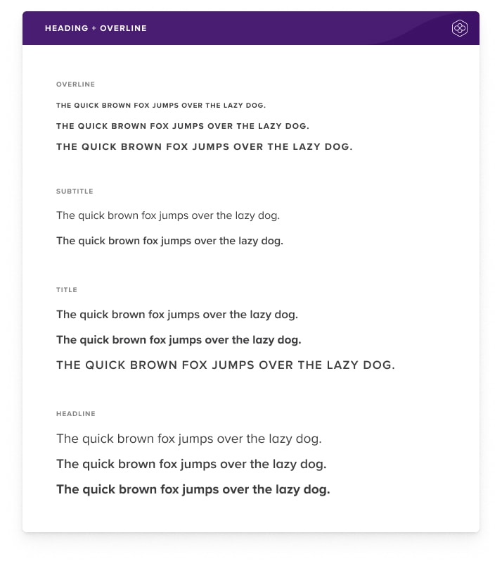
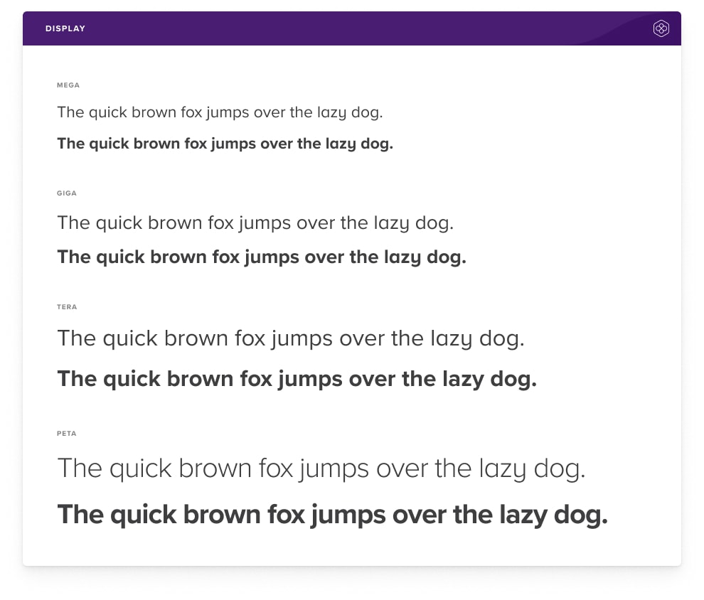
Typography
Our application font is Proxima Nova, a clean and versatile typeface with a solid history of use in applications at scale. It's quite versatile having several variations in weight which make it look great as a heading font and as body text.
We use the alternate "a" as well as "y" which gives the type a more open, friendly feeling.
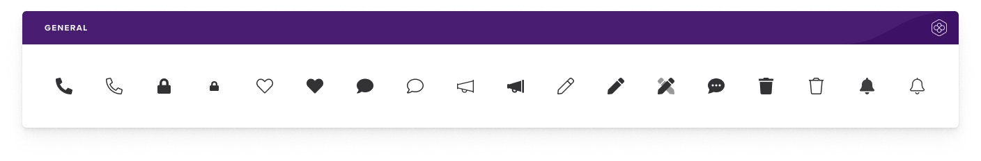
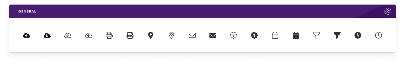
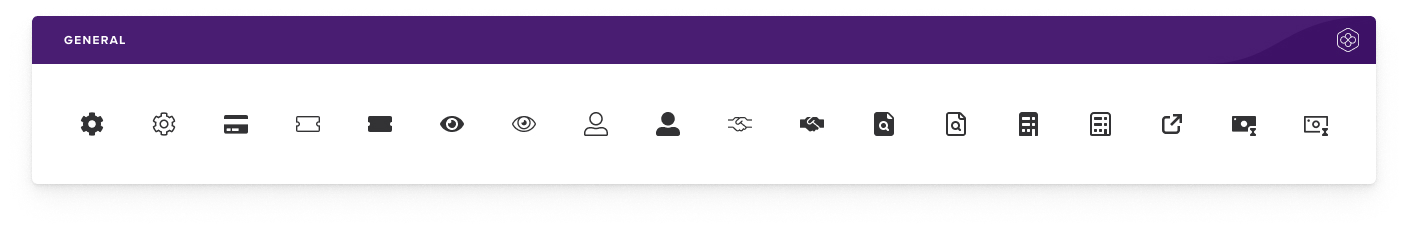
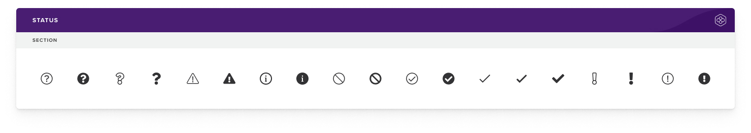
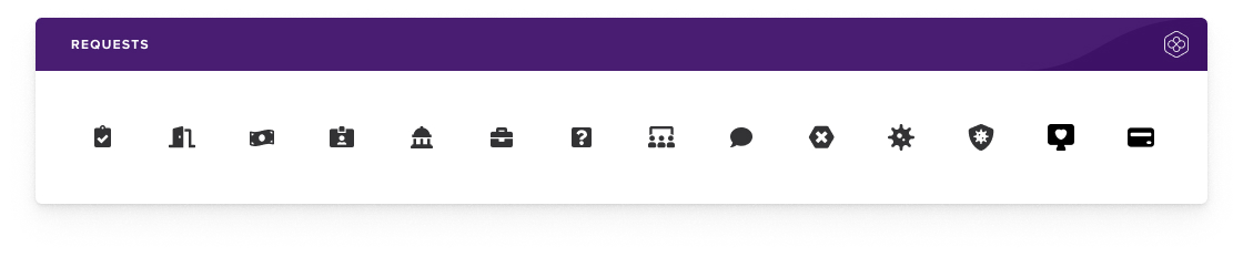
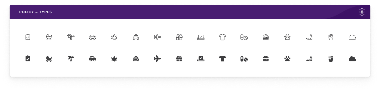
Iconography
For the Pollen Design System, I went with the Font Awesome icon library. It's simple, informative, and complements the overall visual language of the design system. It comes in 3 weights and offers thousands of icons in each weight ensuring we have an icon for every use case.
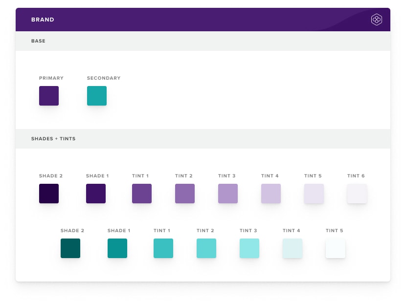
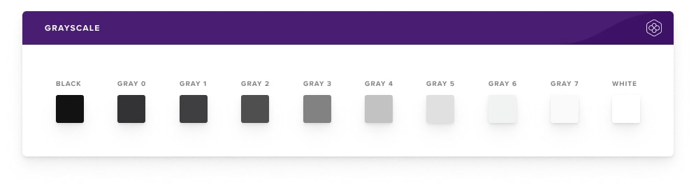
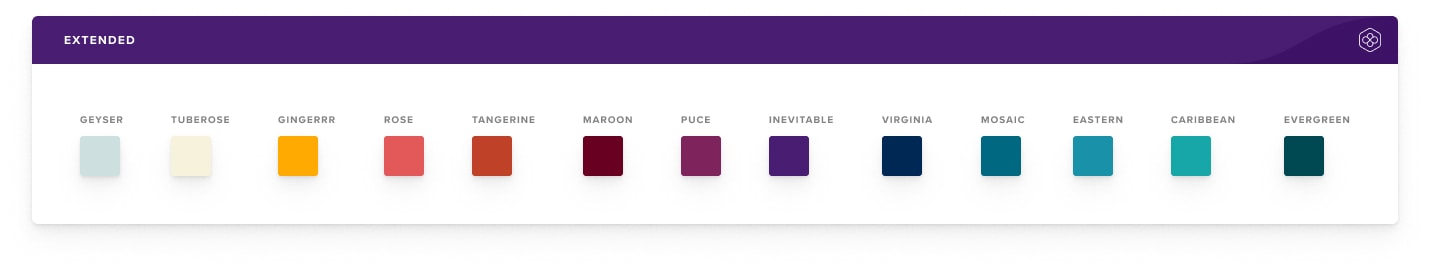
Color Palette
An aesthetically pleasing color palette is obviously important but in application design, we must place a higher value on clear communication. Color can communicate things like the hierarchy of information, interactive states, and the difference between distinct elements.
Colors have meaning and are selected intentionally for their use case as well as for what looks great. Pollen Design System has two base colors with varying shades and tints as well as an extended palette for adding additional context as needed.
We took care in selecting our base colors to maintain a AAA accessibility rating on a light background and at least a AA accessibility rating when used together on opposing backgrounds.
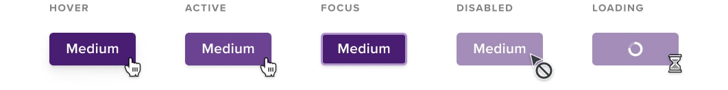
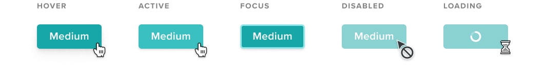
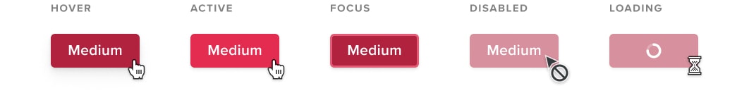
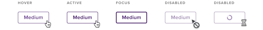
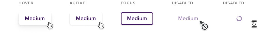
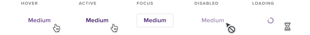
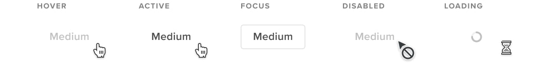
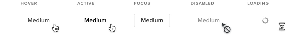
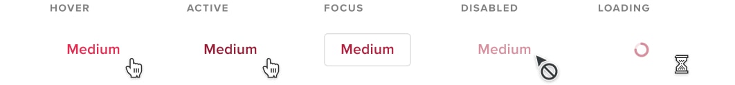
Buttons
Buttons are one of the core elements in any user interface and the Pollen design system is no exception. We have several different button styles giving us flexibility in layout and hierarchy. Buttons come in multiple sizes, have appending and pretending icons, a loading state, and the obvious interaction states.
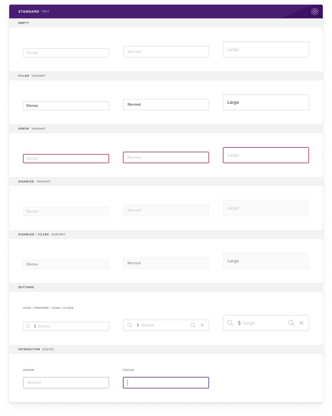
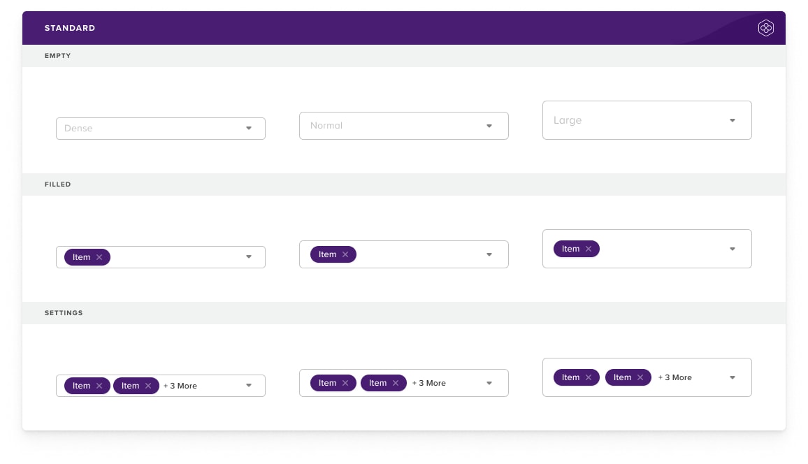
Inputs
Form fields and selection elements are again part of the core of any design system. We use a single input style across the application. It comes in varying sizes and all of the interaction states are accounted for. Of course, we take accessibility into consideration when choosing colors and font sizing.
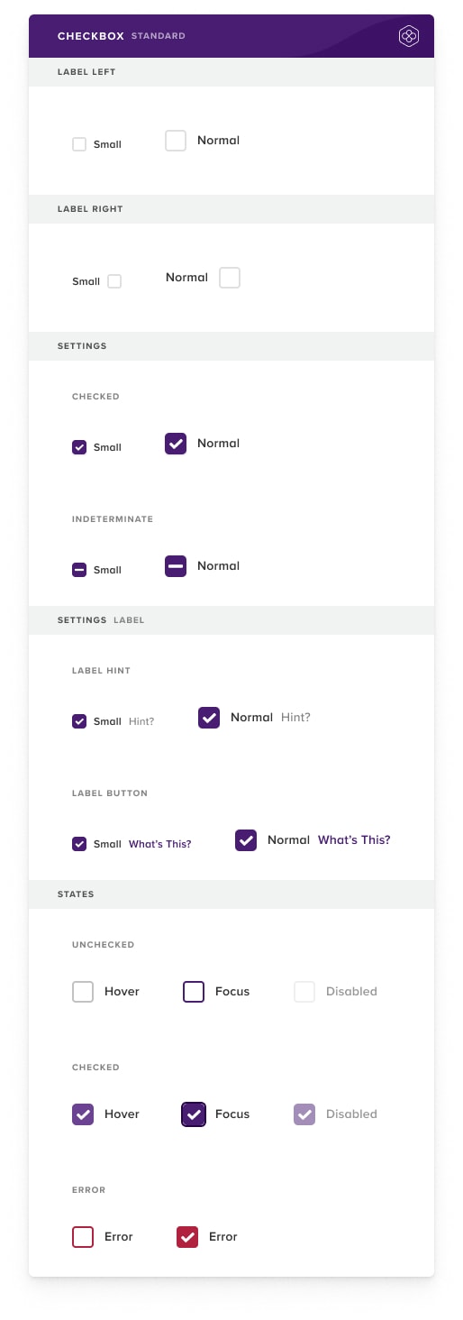
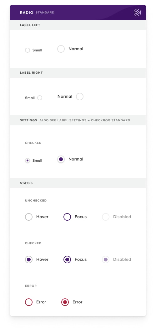
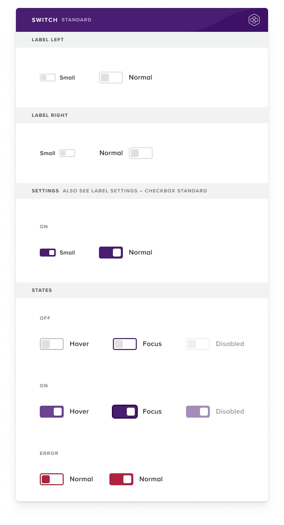
Pollen Design System contains all of the radios, checkboxes, toggles, selection elements one would expect.
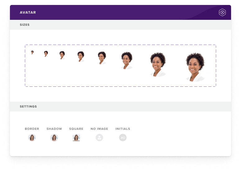
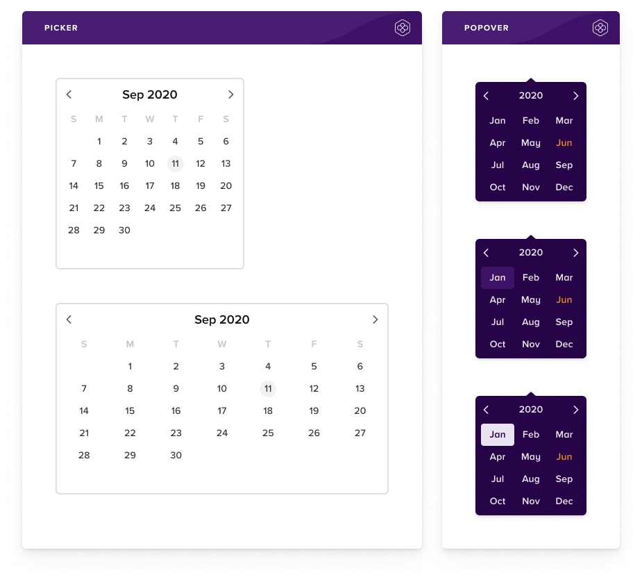
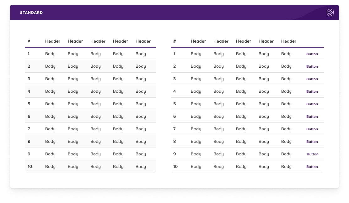
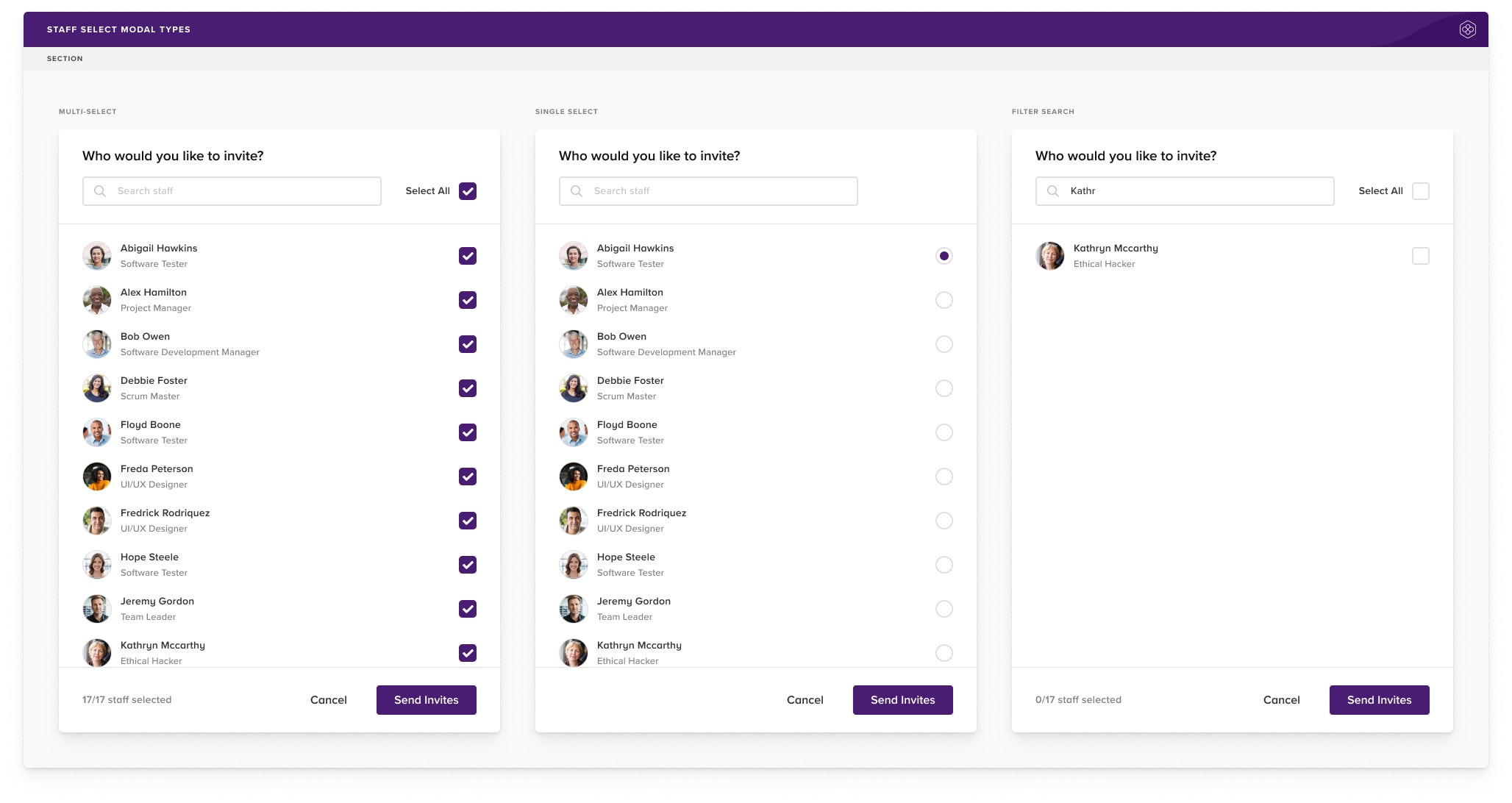
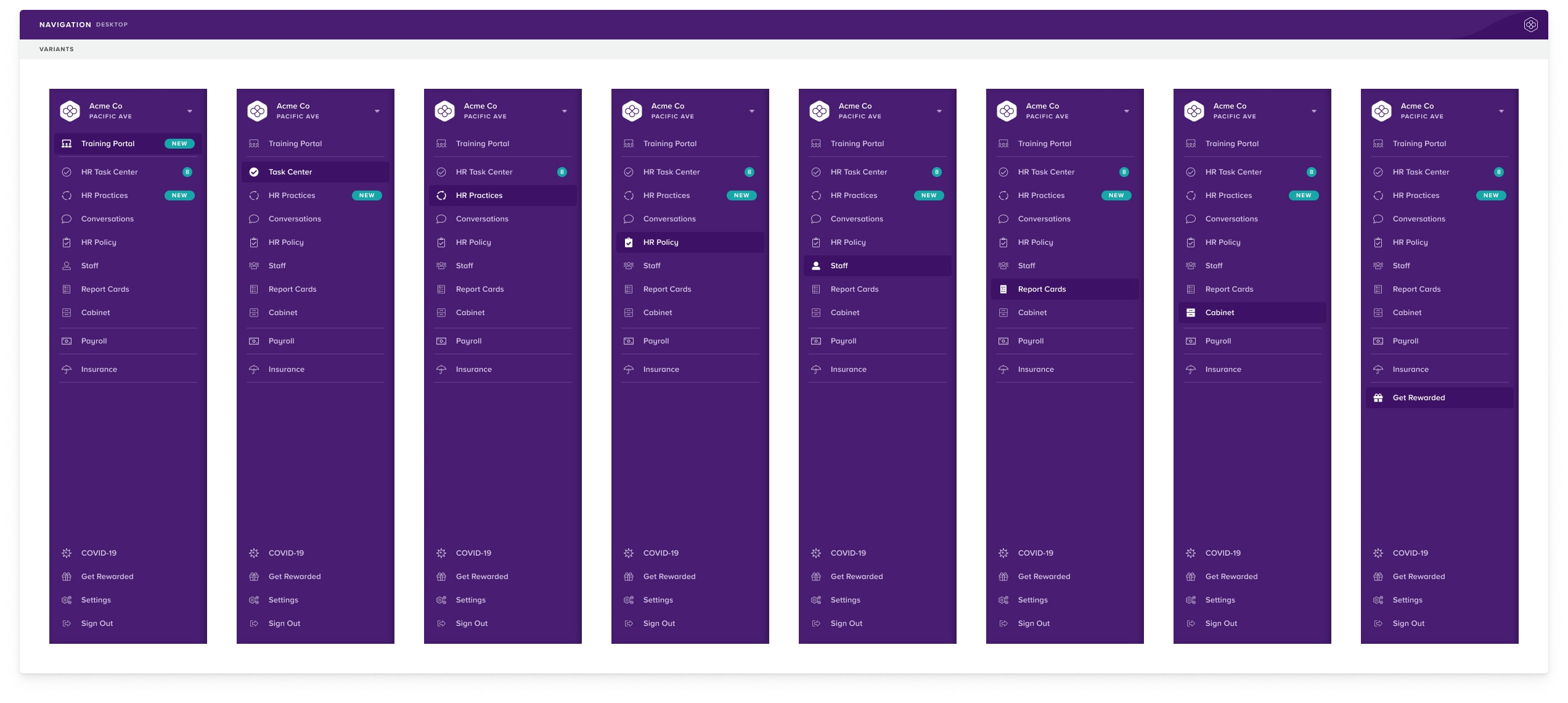
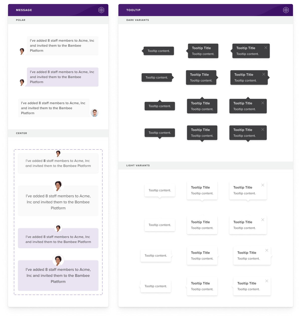
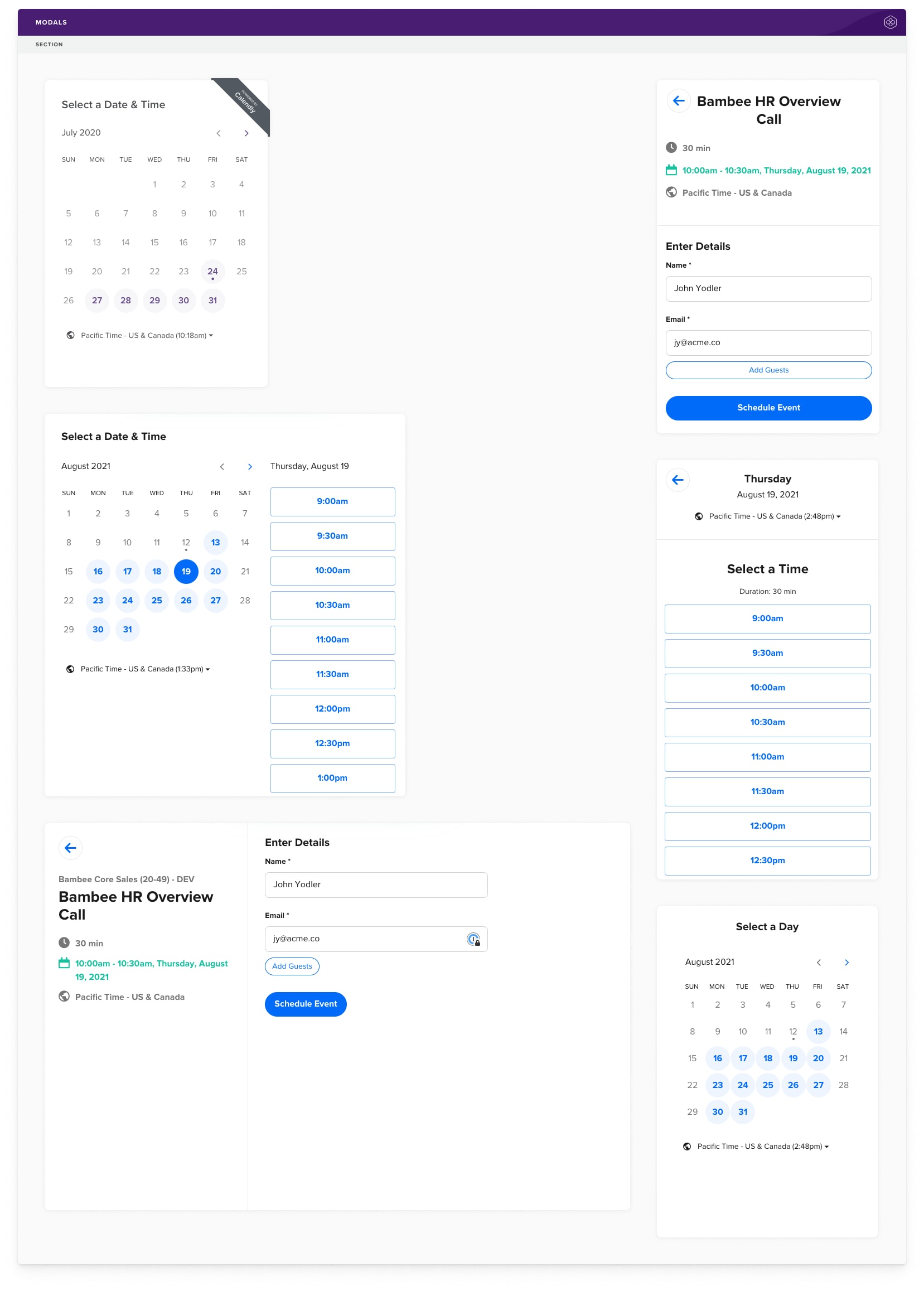
Additional Components
Pollen Design System has many additional components for all manner of uses. From avatars to date pickers to an employee selection modal, Pollen has everything our team needs to build powerful, scalable user interfaces.
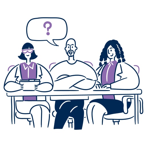
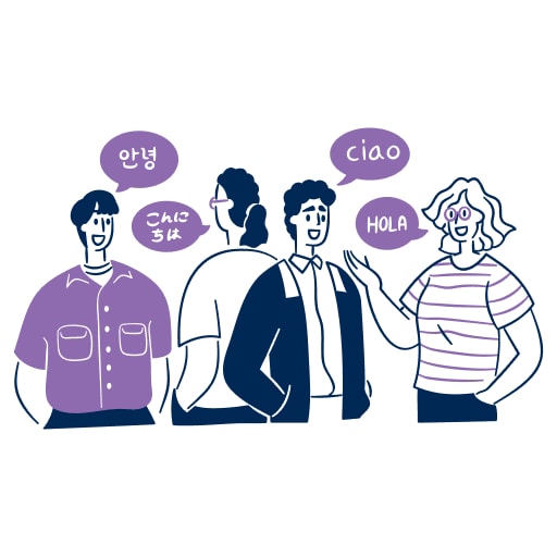
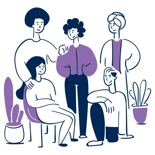
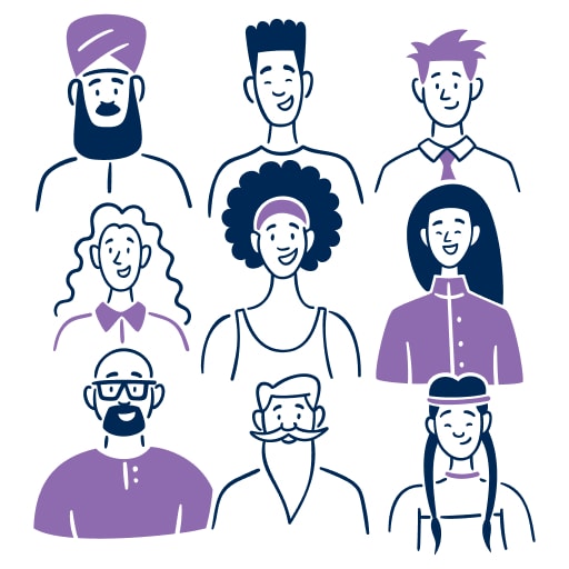
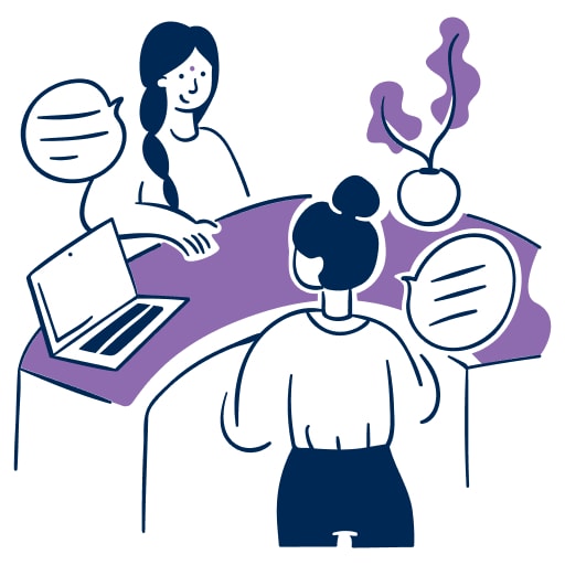
Illustrations
For our in-app illustrations, we chose the Brooklyn Illustration Library from Streamline. The diverse, friendly, animated style brings a simple sophistication to the Bambee platform.


Pollen in Figma
Pollen in Code
Built with 🌴 in Venice, CA
